The scorecard view
A typical procurement scorecard rates each supplier on its own attributes: country risk, financial health, single-site exposure, capacity, inventory, ESG. It's useful, but it can't see what a supplier is connected to.
 Supply Chain Mapper
Graph analytics demo · synthetic data
Most supplier risk tools score each company on its own: its finances, its country, its ESG rating. This demo maps a whole semiconductor supply chain as a network and asks a different question: if this one node fails, how much of the chain goes down with it?
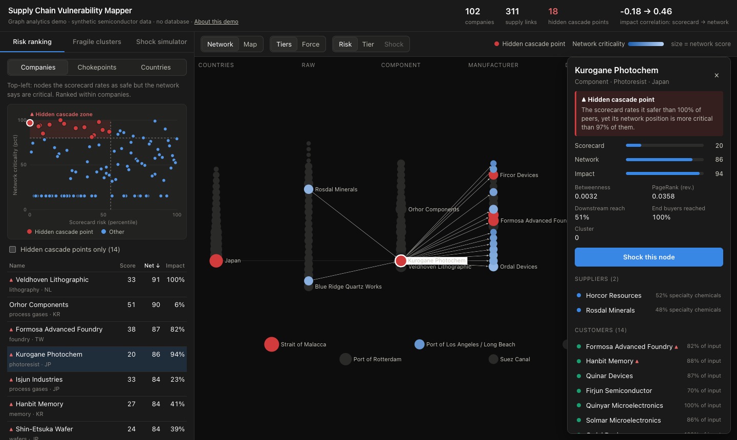
A typical procurement scorecard rates each supplier on its own attributes: country risk, financial health, single-site exposure, capacity, inventory, ESG. It's useful, but it can't see what a supplier is connected to.
Treat the supply chain as a graph and measure each node's position: how many supply paths run through it (betweenness), how much important demand depends on it (PageRank), and how much of the chain sits downstream of it (reach).
Where the two disagree, you find hidden cascade points: a healthy photoresist maker in low-risk Japan, the only lithography toolmaker, a quiet distribution hub in Singapore. Safe on paper, and each one a single point of failure for most of the chain.
The demo has three panels on the left and a main view on the right that switches between a Network graph and a world Map. Click any node, row or dot to open its details.
The scatter plots every company by its scorecard risk (left to right) against its network criticality (bottom to top). The shaded top-left zone is the interesting part: nodes the scorecard calls safe that the network says are critical. They're marked ▲ throughout the app.
The table's Impact column is the check on both scores: the share of end-buyer output lost if that node goes offline. Switch to Chokepoints or Countries to rank those instead.
Try: click Kurogane Photochem. Its scorecard risk is 20 out of 100, the lowest of any company, yet losing it costs 94% of end-buyer output.
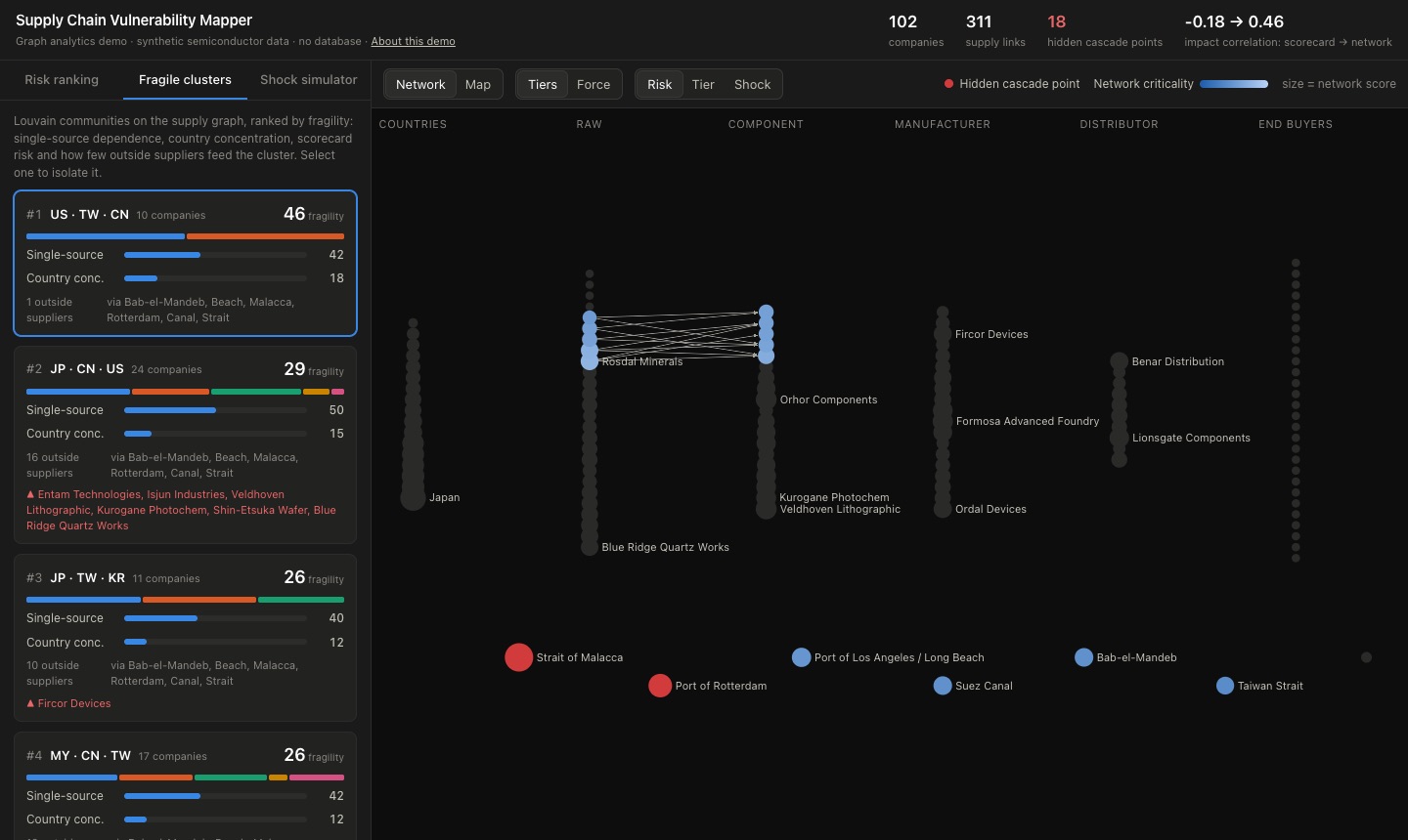
Community detection (Louvain) groups companies that trade mostly with each other. Each cluster is scored for fragility: how much of it relies on a single source, how concentrated it is in a few countries, and how few outside suppliers feed it. Click a cluster to isolate it on the graph.
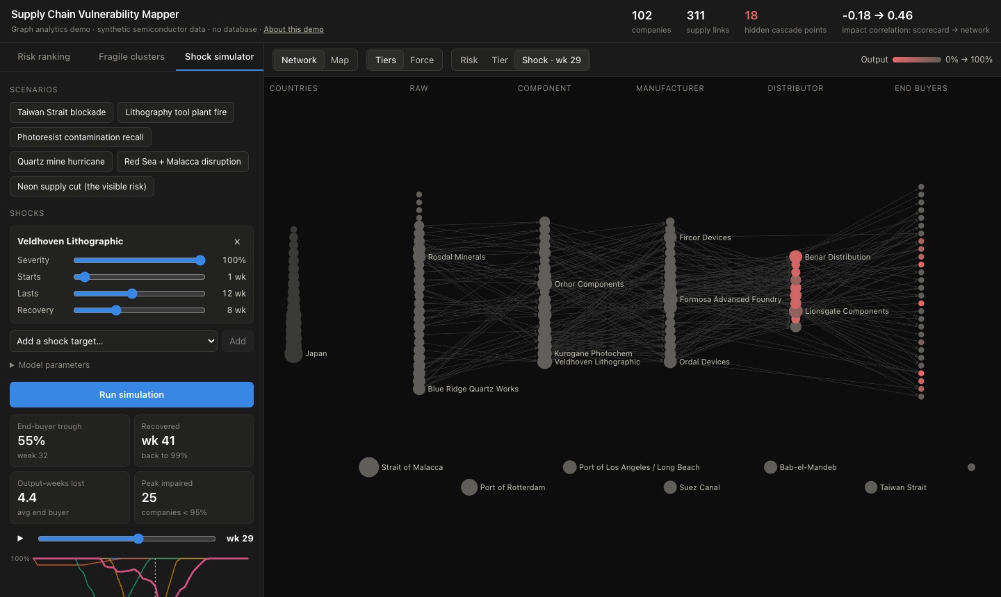
Knock out a company, a country or a chokepoint and watch the disruption travel week by week. Shipments take time to arrive, inventory buys time, alternate suppliers flex up a little, and damaged nodes recover gradually. Nodes turn red as their output drops; press play or drag the timeline to scrub through it.
Try: run Neon supply cut (the visible risk), then Lithography tool plant fire. The scorecard flags the neon supplier as high risk, yet its outage is absorbed completely. The lithography toolmaker looks safe, and its outage cuts end-buyer output to 55% about seven months later.
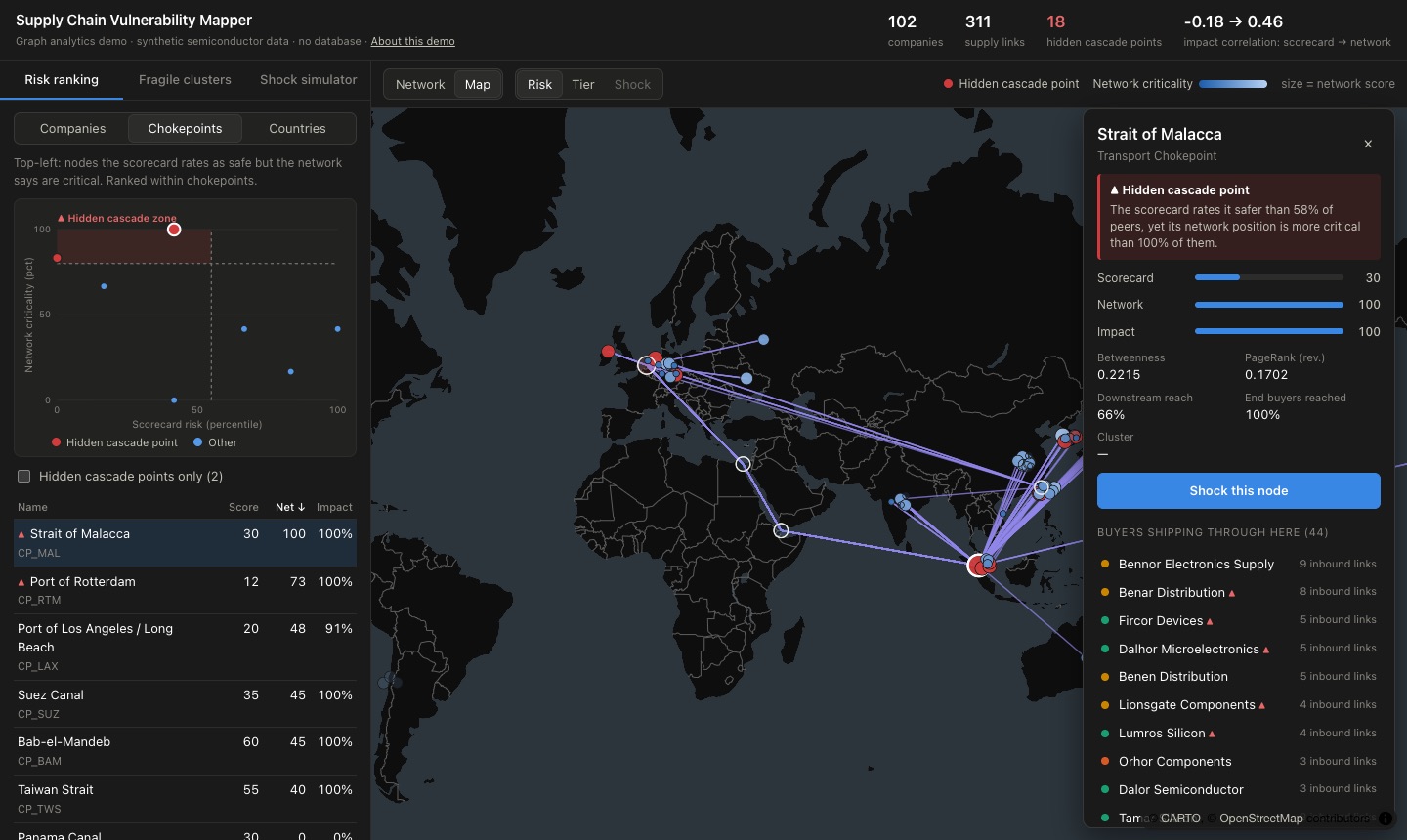
Switch the main view to Map to see the same network on a globe. Shipments are drawn along the chokepoints they pass through, so selecting the Strait of Malacca shows every flow that depends on it.
Every question in this demo is about relationships: who supplies whom, through which port, located in which country, and what sits downstream. That's what graph databases are built for. In a relational database these become chains of joins whose depth you have to know in advance; in a graph they're a single pattern.
Every end buyer exposed to one supplier, however many tiers away:
MATCH (s:Company {name: 'Kurogane Photochem'})
      -[:SUPPLIES*1..6]->(b:Company {tier: 'retailer'})
RETURN DISTINCT b.name
Everything that ships through a chokepoint:
MATCH (a)-[r:SUPPLIES]->(b)
WHERE 'CP_MAL' IN r.route
RETURN a.name, b.name, r.categoryBetweenness, PageRank and Louvain community detection, the three algorithms behind this demo, ship with Neo4j's Graph Data Science library. With a database underneath, scores can be refreshed as suppliers and routes change, and analysts can explore the graph directly instead of waiting on a report.
The data model is simple: Company, Country and Chokepoint nodes,
joined by SUPPLIES, LOCATED_IN and SHIPS_THROUGH relationships.